A sales and content platform focused on Korean skincare
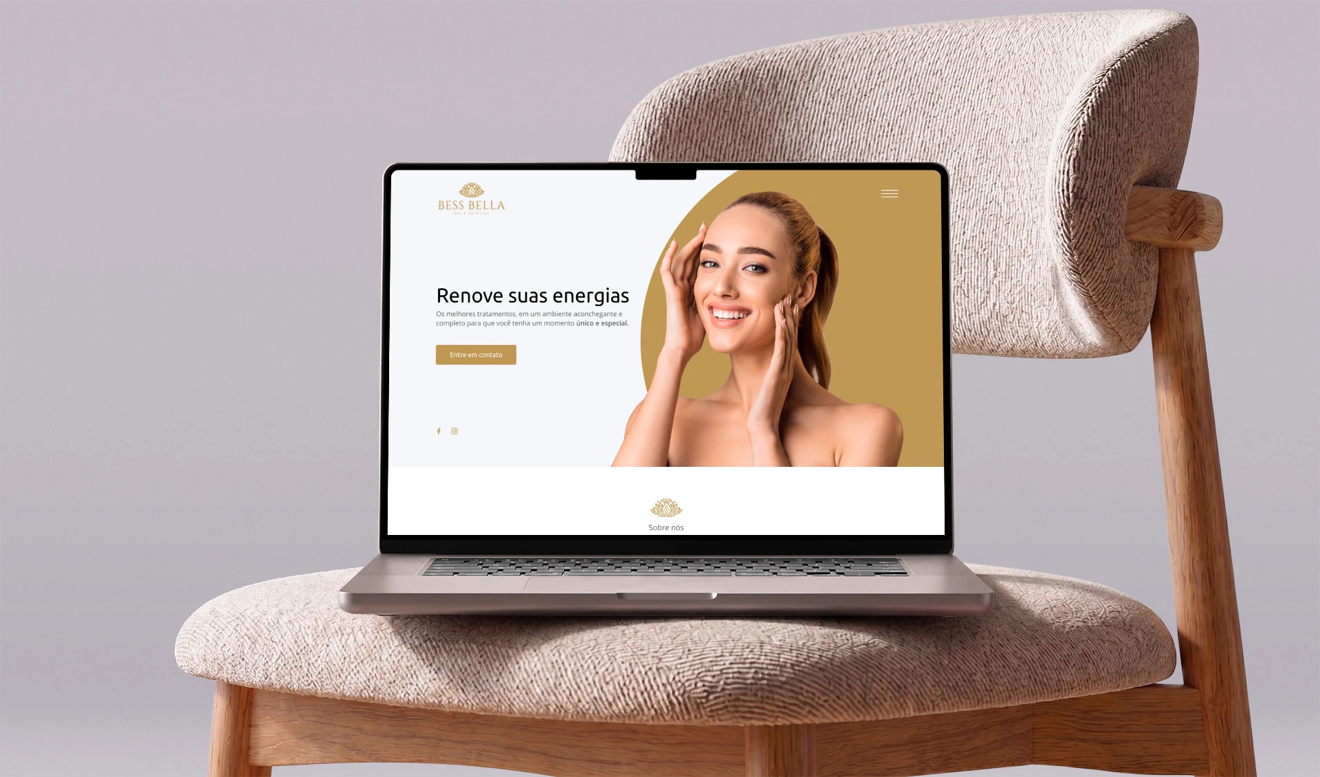
A website that presents the clinic, the Korean care method, the treatments and its own product line, with contact one tap away from any section.
- Korean skincare explained plainly
- Treatment and product in one visit
- Contact one tap away in every section
The challenge
The clinic works with a skincare method almost nobody in Brazil knows, and it also sells its own product. Explaining the method, presenting the treatments and selling the product on the same page, without one drowning out the other, was the layout problem.
The solution
An editorial sequence: the clinic introduces itself, the method is explained in running text, the treatments appear as navigable areas and the clinic's own product gets its own block, with a coupon and checkout. Contact follows the reader all the way through.
What was delivered
-
The clinic and the method
What Korean skincare is and how the assessment works, in running text and without jargon.
-
Navigable treatments
Each treatment area with its own explanation, without forcing the reader through the whole page.
-
Own product line
The clinic's line with its own block, coupon and direct purchase.
-
Contact in every section
WhatsApp and assessment requests one tap away, wherever the decision happens.
How it was built
- Website WordPress
- Content the clinic updates on its own, from treatments to product campaigns.
Details
Korean skincare is a selling point that only works if someone explains what it means. The clinic had the explanation; it lacked the place for it.
The website gives room to text where it is needed, in presenting the method and the assessment, and turns visual again where the decision is visual: in the treatments and the product line. Conversion does not depend on a single call to action at the top, because the decision matures along the page.